Home >>Bootstrap Tutorial >Bootstrap Fixed Navigation Bar
Bootstrap Fixed Navigation Bar
Fixed Navigation Bar
Bootstrap provides you to fixed the navigation bar using predefined classes. Add class fixed-top (fixed navbar at the top), fixed-bottom (fixed navbar at the bottom) and use class sticky-top (when scrolling page it can fixed the nanvbar at the top) together with class navbar in <nav> element.
Sticky Navbar
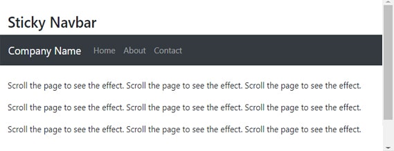
To display the sticky navbar to the page. You can add class sticky-top to the <nav> element with the class navbar. when scroll the page, You will see the effect of sticky navbar. Sticky navbar are stay at the top.
Let's take An example of sticky navbar:
<!DOCTYPE html>
<html>
<head>
  <title>Bootstrap Fixed navigaion bar</title>
  <meta charset="utf-8">
  <meta name="viewport" content="width=device-width, initial-scale=1">
  <link rel="stylesheet" href="https://maxcdn.bootstrapcdn.com/bootstrap/4.4.1/css/bootstrap.min.css">
  <script src="https://ajax.googleapis.com/ajax/libs/jquery/3.4.1/jquery.min.js"></script>
  <script src="https://cdnjs.cloudflare.com/ajax/libs/popper.js/1.16.0/umd/popper.min.js"></script>
  <script src="https://maxcdn.bootstrapcdn.com/bootstrap/4.4.1/js/bootstrap.min.js"></script>
</head>
<body>
<div class="container-fluid">
  <br>
  <h3>Sticky Navbar</h3>
</div>
<nav class="navbar navbar-expand-sm bg-dark navbar-dark sticky-top">
  <a class="navbar-brand" href="#">Company Name</a>
  <ul class="navbar-nav">
    <li class="nav-item">
      <a class="nav-link" href="#">Home</a>
    </li>
    <li class="nav-item">
      <a class="nav-link" href="#">About</a>
    </li>
	<li class="nav-item">
      <a class="nav-link" href="#">Contact</a>
    </li>
  </ul>
</nav>
<div class="container-fluid"><br>
  <p>Scroll the page to see the effect. Scroll the page to see the effect. Scroll the page to see the effect.</p>
  <p>Scroll the page to see the effect. Scroll the page to see the effect. Scroll the page to see the effect.</p>
  <p>Scroll the page to see the effect. Scroll the page to see the effect. Scroll the page to see the effect.</p>
  <p>Scroll the page to see the effect. Scroll the page to see the effect. Scroll the page to see the effect.</p>
   <p>Scroll the page to see the effect. Scroll the page to see the effect. Scroll the page to see the effect.</p>
  <p>Scroll the page to see the effect. Scroll the page to see the effect. Scroll the page to see the effect.</p>
  <p>Scroll the page to see the effect. Scroll the page to see the effect. Scroll the page to see the effect.</p>
  <p>Scroll the page to see the effect. Scroll the page to see the effect. Scroll the page to see the effect.</p>
   <p>Scroll the page to see the effect. Scroll the page to see the effect. Scroll the page to see the effect.</p>
  <p>Scroll the page to see the effect. Scroll the page to see the effect. Scroll the page to see the effect.</p>
  <p>Scroll the page to see the effect. Scroll the page to see the effect. Scroll the page to see the effect.</p>
  <p>Scroll the page to see the effect. Scroll the page to see the effect. Scroll the page to see the effect.</p>
</div>
</body>
</html>

Fixed top
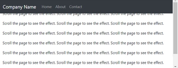
To display the fixed-top navbar to the page. You can add class fixed-top to the <nav> element with the class navbar. when scroll the page, You will see the effect of fixed-top navbar. Fixed-top navbar are fixed at the top.
Let's take An example of fixed-top navbar:
<!DOCTYPE html>
<html>
<head>
  <title>Bootstrap Fixed navigaion bar</title>
  <meta charset="utf-8">
  <meta name="viewport" content="width=device-width, initial-scale=1">
  <link rel="stylesheet" href="https://maxcdn.bootstrapcdn.com/bootstrap/4.4.1/css/bootstrap.min.css">
  <script src="https://ajax.googleapis.com/ajax/libs/jquery/3.4.1/jquery.min.js"></script>
  <script src="https://cdnjs.cloudflare.com/ajax/libs/popper.js/1.16.0/umd/popper.min.js"></script>
  <script src="https://maxcdn.bootstrapcdn.com/bootstrap/4.4.1/js/bootstrap.min.js"></script>
</head>
<body style="height:1500px">
<div class="container-fluid">
  <br>
  <h3>fixed top</h3>
</div>
<nav class="navbar navbar-expand-sm bg-dark navbar-dark fixed-top">
  <a class="navbar-brand" href="#">Company Name</a>
  <ul class="navbar-nav">
    <li class="nav-item">
      <a class="nav-link" href="#">Home</a>
    </li>
    <li class="nav-item">
      <a class="nav-link" href="#">About</a>
    </li>
	<li class="nav-item">
      <a class="nav-link" href="#">Contact</a>
    </li>
  </ul>
</nav>
<div class="container-fluid"><br>
    <p>Scroll the page to see the effect. Scroll the page to see the effect. Scroll the page to see the effect.</p>
  <p>Scroll the page to see the effect. Scroll the page to see the effect. Scroll the page to see the effect.</p>
  <p>Scroll the page to see the effect. Scroll the page to see the effect. Scroll the page to see the effect.</p>
  <p>Scroll the page to see the effect. Scroll the page to see the effect. Scroll the page to see the effect.</p>
   <p>Scroll the page to see the effect. Scroll the page to see the effect. Scroll the page to see the effect.</p>
  <p>Scroll the page to see the effect. Scroll the page to see the effect. Scroll the page to see the effect.</p>
  <p>Scroll the page to see the effect. Scroll the page to see the effect. Scroll the page to see the effect.</p>
  <p>Scroll the page to see the effect. Scroll the page to see the effect. Scroll the page to see the effect.</p>
   <p>Scroll the page to see the effect. Scroll the page to see the effect. Scroll the page to see the effect.</p>
  <p>Scroll the page to see the effect. Scroll the page to see the effect. Scroll the page to see the effect.</p>
</div>
</body>
</html>

Fixed Bottom
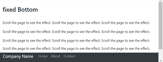
To display the fixed-bottom navbar to the page. You can add class fixed-bottom to the <nav> element with the class navbar. when scroll the page, You will see the effect of fixed-bottom navbar. Fixed-bottm navbar are fixed at the bottom.
Let's take An example of fixed-bottom navbar:
<!DOCTYPE html>
<html>
<head>
  <title>Bootstrap Fixed navigaion bar</title>
  <meta charset="utf-8">
  <meta name="viewport" content="width=device-width, initial-scale=1">
  <link rel="stylesheet" href="https://maxcdn.bootstrapcdn.com/bootstrap/4.4.1/css/bootstrap.min.css">
  <script src="https://ajax.googleapis.com/ajax/libs/jquery/3.4.1/jquery.min.js"></script>
  <script src="https://cdnjs.cloudflare.com/ajax/libs/popper.js/1.16.0/umd/popper.min.js"></script>
  <script src="https://maxcdn.bootstrapcdn.com/bootstrap/4.4.1/js/bootstrap.min.js"></script>
</head>
<body>
<div class="container-fluid">
  <br>
  <h3>fixed Bottom</h3>
</div>
<nav class="navbar navbar-expand-sm bg-dark navbar-dark fixed-bottom">
  <a class="navbar-brand" href="#">Company Name</a>
  <ul class="navbar-nav">
    <li class="nav-item">
      <a class="nav-link" href="#">Home</a>
    </li>
    <li class="nav-item">
      <a class="nav-link" href="#">About</a>
    </li>
	<li class="nav-item">
      <a class="nav-link" href="#">Contact</a>
    </li>
  </ul>
</nav>
<div class="container-fluid"><br>
   <p>Scroll the page to see the effect. Scroll the page to see the effect. Scroll the page to see the effect.</p>
  <p>Scroll the page to see the effect. Scroll the page to see the effect. Scroll the page to see the effect.</p>
  <p>Scroll the page to see the effect. Scroll the page to see the effect. Scroll the page to see the effect.</p>
  <p>Scroll the page to see the effect. Scroll the page to see the effect. Scroll the page to see the effect.</p>
   <p>Scroll the page to see the effect. Scroll the page to see the effect. Scroll the page to see the effect.</p>
  <p>Scroll the page to see the effect. Scroll the page to see the effect. Scroll the page to see the effect.</p>
  <p>Scroll the page to see the effect. Scroll the page to see the effect. Scroll the page to see the effect.</p>
  <p>Scroll the page to see the effect. Scroll the page to see the effect. Scroll the page to see the effect.</p>
   <p>Scroll the page to see the effect. Scroll the page to see the effect. Scroll the page to see the effect.</p>
  <p>Scroll the page to see the effect. Scroll the page to see the effect. Scroll the page to see the effect.</p>
</div>
</body>
</html>

